John was scrolling through a travel website on his new foldable smartphone. He unfolded the screen to look at the vacation photos on a bigger display. But there was a problem. The images looked weird; the text overlapped poorly. And the navigation menu was unusable. Frustrated, he quit the website and went to a competitor’s website.
This is not just John’s experience. Many users with modern smartphones face these issues. Today, foldable phones, ultra-wide monitors, and smart TVs. have become common. It has changed the way we browse. Classic device-optimized websites can’t keep up anymore with these modern devices. It was amazing when it was introduced one decade ago. However responsive web design is showing its limitations in today’s dynamic digital world.
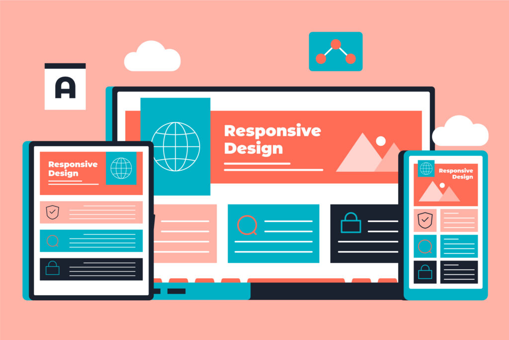
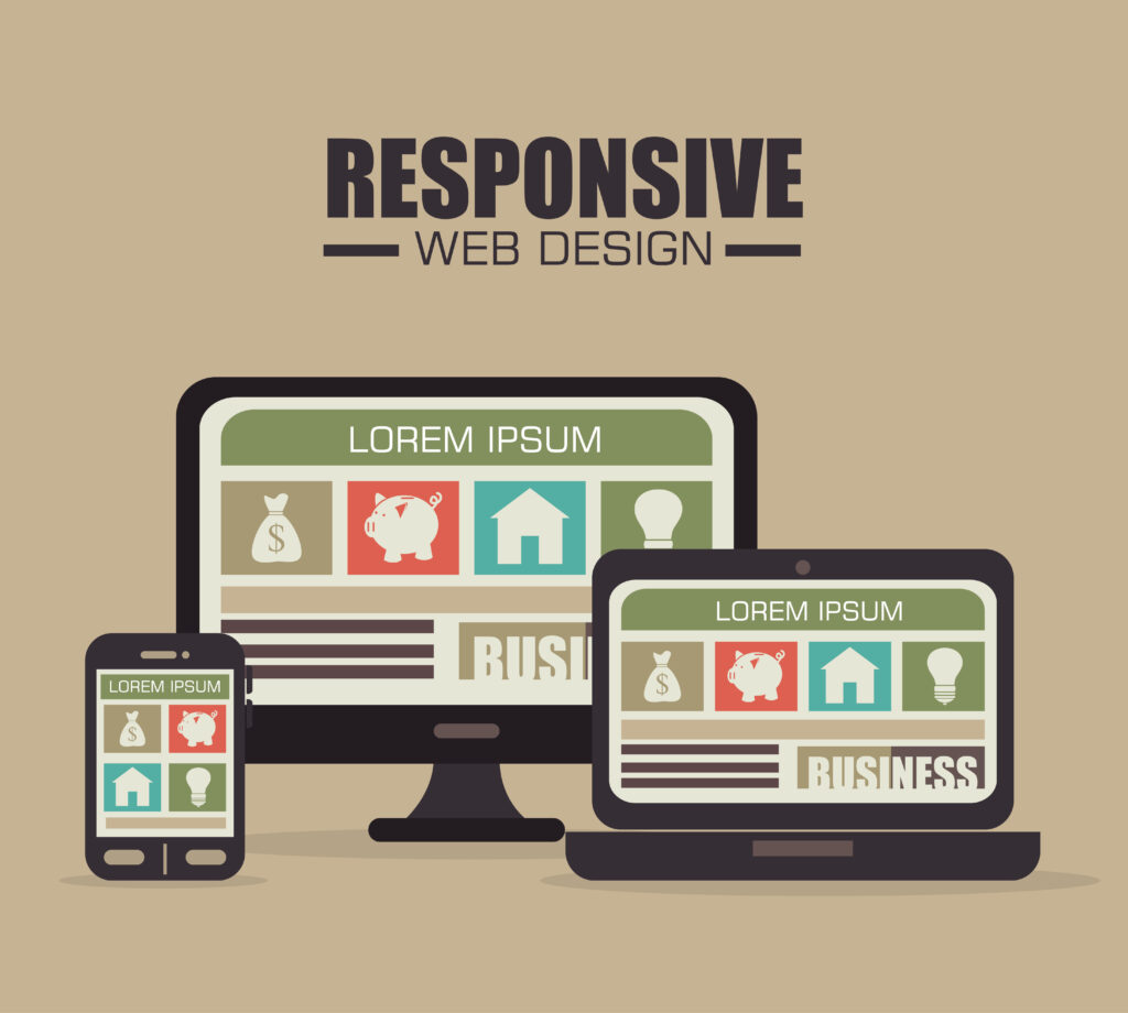
What is Responsive Web Design (RWD)?
It is an approach to responsive web design that takes care of website adaptation to numerous screen sizes. Some of the tools in this approach are:
- Media queries use different styles according to devices.
- Flexible grid that resizes the layout according to the size of the viewing screen.
- Fluid images that alter their sizes to fit the available space.
The concept of responsive web design is based on having a consistent experience that is useful for users using any kind of device. A website designing company makes websites that work on all devices and screen sizes. Responsive design is important because people use the internet on various devices.
If the website does not work properly on these devices, there can be problems. Like the text may be too small to read, pictures can appear cut off or the buttons and menus cannot function. Slow loading and messy designs will frustrate the user.
Responsive designs ensure websites look good and work smoothly. They make websites easier to read and use. It also improves the performance on mobile devices. A website designing agency makes sure your RWD website works on all devices.
The Limitations of Responsive Web Design
Ethan Marcotte introduced “Responsive Web Design” in 2010. But he likely didn’t foresee today’s wide range of devices. Foldable phones, ultra-wide monitors, smartwatches, and smart TVs have changed the browsing experience. These devices bring new challenges to web design.
His idea of flexible grids, fluid images, and media queries changed website design. They helped websites to work well on many screens. But as technology keeps growing, traditional mobile-friendly website design is falling behind.
Let us explore the key challenges dynamic web design faces today.
1. Devices are too varied
Mobile-friendly designs worked perfectly when desktop, tablet, and mobile started. But the smart gadgets available now offer unique screen sizes. Responsive web designs rely on fixed “breakpoints” to adjust layouts. So now it’s a problem determining what breakpoints you should apply to the new devices. This issue can be solved by
- Using breakpoints that automatically change according to the device
- Add container queries so that design changes depend on a part of the page rather than the entire screen. A website designing company can research the devices your users use. And then they make your website perfectly fit for those devices.
2. Performance issues
Most websites are designed using a mobile-first approach. This is because mobile devices are most commonly used for browsing. But this often results in loading extra files such as large images that slow things down. This slowing is very challenging for users who are in areas with slow internet.
In this case, the solution is either conditional loading or lazy loading. The server-side rendering also can solve this problem.
- Conditional loading loads only the files that each device needs
- Lazy loading will load images or videos only when people scroll through them.
- Server-side rendering sends smaller, faster files directly from the server to mobile devices.
3. One size does not fit all
- Multi-device web design attempts to present the same experience across devices. But this causes more problems than solutions. For example, a menu developed for a desktop will be challenging to use on phones. The text also will not be correctly displayed.
- Adaptive design and creating device-specific layouts are commonly used in web design today. It can fix display problems on different devices. The problem with fonts can be cleared by using flexible fonts that can adapt to screen sizes. A website designing agency can alter your website layout to match the device. In this way, they ensure that the users get the best experience.
4. Ignoring contexts
In dynamic web design, how users interact with the website is never taken into consideration. It always focuses on screen size. For example, people browsing on mobile might want less content to save data. But responsive sites often load everything anyway.
- Using a context-aware design will adjust according to the user’s situation. Examples are: showing a map if the store is near
- lowering the image quality or size for a slower internet connection.
- Attempt a progressive disclosure by showing the most important information first. Hide the extra details until needed.
5. Accessibility issues
Many responsive websites are not accessible to everyone. Small buttons can be hard to press, and low-contrast text can be readable. This occurs especially on smaller or brighter screens. In this design, use large, easy-to-tap buttons for mobile users. Also, test web pages with accessibility tools such as screen readers. This ensures that they are accessible to everyone. Select high-contrast colors and easy-to-read fonts for the text.
Why does this matter?
As new devices come in, websites have to keep up so that they will work well for everyone. Modern challenges need modern solutions. This ensures the best experience, regardless of the device. We can create fast and easy-to-use websites, accessible to all if we improve dynamic web design. A website designing company can assist your website to face challenges and run smoothly on all devices.
The Future of Web Design Going Beyond RWD

The future of web design is not only about making websites look nice on different screen sizes. It’s about creating an adaptable, fast, and seamless experience. It should also align with the user’s real-time context.
They should also think about things like the user’s location, and internet speed and change to fit that. A website designing company creates future-ready websites that can support your business. These websites go beyond responsive website design.
Context-aware design also brings new possibilities in website design.
Progressive web apps (PWAs) represent the future of user interaction. The component-based design is the trending approach in the future. Coders use React or Vue.js to focus on reusable components that may change according to the device.
Conclusion
The evolution of web technology makes responsive web design an important approach. It helps adapt websites for all devices. Modern websites must be fast, adaptable, and context-aware. It should deliver rich experiences regardless of any device.
It is time for web developers to break the boundaries of traditional RWD. They can embrace adaptive designs, PWAs, context-aware strategies, and component-based frameworks.
A web designing company helps businesses to ensure that their websites are functional. And check whether the website is up-to-date in terms of new devices and technology.The future of web design is in creating personalized, fast websites. Such websites also give dynamic experiences whether on a phone, tablet, or smart TV. A website designing agency makes websites that fit all screen sizes. They also adjust it to what user’s need at the moment. Creativity, speed, and inclusivity will shape the website in 2025.